Inspired by Edith Holden’s book…The Country Diary of an Edwardian Lady

Edith Holden’s book for inspiration
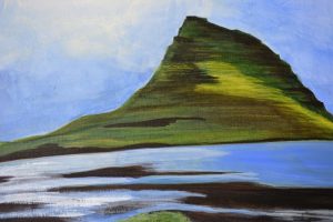
This book holds a special place in my heart since it belonged to my mother. She died in 1983 of cancer and honestly anything that I have of hers is special to me. Whether it is a teapot, china dishes, a wooden butter mold from the farm where she grew up, hand written notes and cards, or this lovely book, these physical treasures bring me joy. They are forever keepers. On page 63 and 64 Edith shares a poem and watercolor paintings of botanicals in bloom during the month of May. The wildlife surrounding her home in Olton, Warwickshire provided the inspiration for everything in her book. Edith had a deep love of nature and her drawings are done with a keen eye for detail, and a naturalists view of the world. I used her drawings of Wild Arum and Common Garlic as inspiration for my abstract art journal page.
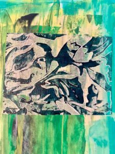
Stamped image on tissue and adhered to “clean up paint page”
Whenever there is leftover paint on my palette, I always find a place to use it on a blank art journal page. This eliminates the white page syndrome and gives me a springboard for developing an art journal page. The first layers were teal, green and yellow paint scraped onto the page with a used gift card. I also made a lino-carved stamp and had applied it to tissue as an experiment. The colors worked perfectly so using matte medium I adhered the stamped tissue to the page. This had been in my art journal for quite awhile. Just before Mother’s Day I was reading The Country Diary and enjoying Edith’s poetry, musings and drawings about May. I opened my art journal to find a page for creating what I call an “abstract botanical”, focusing on the negative spaces, and came up with this one. Using a pencil I drew in botanical shapes, picked up my sharpie black marker and went to work.

Abstract Botanical and Negative Spaces
By layering the botanicals and overlapping the printed tissue, something unique started to emerge. Keep in mind, this is a what-if exercise, a time for discovery, and experimenting with a new technique. In preparing for a new class, and auditioning ideas, I am honing in on this idea. Abstract Botanicals is going to be the theme, and exploring negative space. It is challenging to use the negative space. I found myself bobbing between the positive and negative areas, and that’s when it dawned on me how useful this technique can be for developing the right brain.

Abstract Botanical
Here is the finished page and the botanical images I used. Colored pencils darkened the green and yellow values. A trusty black Sharpie, a very simple tool, in a fine point and chisel point highlighted the negative space. This is just a start. I hope to pursue this and refine the technique so I can bring it to you in class at Bemis.

I love black and white images!
A black and white image is always a good tool for seeing the values without color. And besides, I love black and white photography. I hope you enjoyed stopping by. As always, thanks for taking the time to read my blog and catch up on what’s happening in my studio.


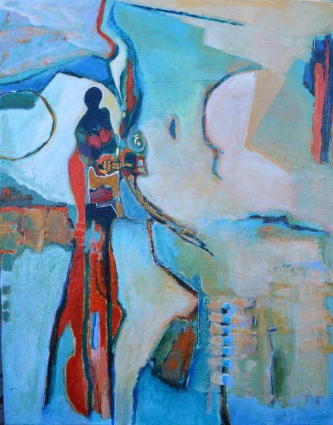 Here is a close up of a painting that I just completed. There are so many layers of paint on this canvas, it is unbelievable. I started by painting loosely and letting my muse out to play. It sounds fun, and it is, but let me just say once the figure emerged, the design and color scheme became challenging. It was a constant push and pull of color and shapes, and finding a balance of the two. There is a small bit of collage that I left without paint, the word earth…and a bit of Hebrew text. When the shapes began to form, the painting looked like land masses viewed from an airplane window. I enjoyed the process of letting the painting give me direction, being free to apply paint and then cover it up leaving just a small glimpse of the previous layer. This created a depth of experience for me as the artist, and also invites the viewer to come closer and see the elements of a hidden layer. The intent of my painting was to capture the essence of land masses, and the secrets held beneath the top layer. Whether gifts of nature or the work of man, the land beneath our feet is full of secrets.
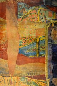
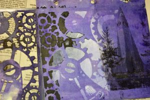 The first application was to cover chip board pages in white gesso and then a layer of hard pastels in various colors was added just before the gesso dried. Acrylic inks applied over stencils created another layer.
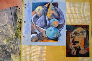


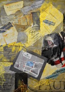


 Fused shopping bag makes for a great journal page. With an iron on a medium setting, place 3 to 4 bags together with the “star bag” on top. Lay parchment paper on top of the pile of bags, and parchment underneath the bundle. Iron away, slowly, to fuse them together. Trim to the right size, and hole punch the edge… wa-la… a page of texture and a reminder of shopping at Harrods!
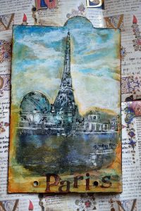 Photo image transfer with acrylic paint and some vintage letter stamps, a family heirloom one of the students brought to class for all of us to use.
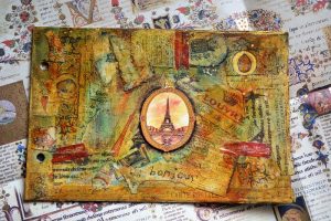
 Letters made with clear tar gel and acrylic paint.
 Stencils and drips make for interesting backgrounds.
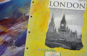
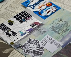
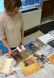
 Teaching Travel Pages was a wonderful experience for me, and the pages created by each student were full of interesting subjects, techniques, color combinations, and layers of collage. Every student had an approach that reflected their personal travel experience. Each page was unique and demonstrated a flair for using ephemera from their adventures to make artful pages. Maybe it is time for you to pull out those maps, brochures, postcards, photographs, ticket stubs, crumpled napkins, and found papers to create an artifact of your travel escapades. It is easy to put a travel journal together using some of the techniques I have described, it just takes time, a precious commodity…but it is worth the effort!
